

Investigating Changes Made By AI
Changing CSS Styles of the Blog
So, I began investigating the styles of callouts on the blog. The foregound and background colors blend together too much and I need both the text to standout in the callout and the callout to standout against the blog. I want to achieve something more akin to Confluence's warning.

Looks nice, right?
Recall, I want to do the least work possible with my own hands, but this is a place where I may have to get my hands dirty. So...this time, we're actually going to look at some blog code -- and I'm as nervous as you are 😅!
Here's the current callout:

You can see that it's...less than ideal. This time I got curious about what was going on, so I took a peek into the css itself. When "I created" this blog (by instructing AI), I asked it to use Tailwind and Next.js. I've never used Next.js so I thought that would be a great choice that would force me to ask the AI to help teach me how to use this framework, though I have dabbled in React. I also know nothing of Tailwind, so I have another learning opportunity.
/* Warning callouts */
.prose .callout.warning {
  @apply bg-yellow-200 border-yellow-500 text-yellow-800;
}

.prose .callout.warning::before {
  content: '⚠️';
  font-size: 18px;
  line-height: 20px;
}
This is the CSS code...seems alright? So, naturally I'm left wondering "what the fuck?" Let's look at the computed style of the warning callout.

Remember, I don't know much about Tailwind...so you may already have better
leads than I, but this is a journey into "how much can I avoid doing?" I take a
peek at the computed style, wondering what the actual rendering is and I notice
something peculiar: background-color: rgb(113 63 18 / 0.4);
/ 0.4scratchy scratch 
It looks like we're setting it to 40% opacity. I take a peek at the
Tailwind docs on colors where they
mention that we can adjust opacity by using a /% suffix such as /40. I don't
see this on the CSS that I posted above, but I try to force the situation with a
/100.
/* Warning callouts */
.prose .callout.warning {
  @apply bg-yellow-200/100 border-yellow-500 text-yellow-800/100;
}
You have probably already guessed, but this did absolutely nothing! Next, I
use my elite programming skills and I ctrl+f for /40. I find it here:
/* Dark theme support for callouts */
@media (prefers-color-scheme: dark) {
  .prose .callout.info {
    @apply bg-blue-900/40 border-blue-400 text-blue-100;
  }

  .prose .callout.warning {
    @apply bg-yellow-900/40 border-yellow-400 text-yellow-100;
  }
DARK THEME SUPPORT!? I love me some dark mode, but I had no idea that this was implemented! Clearly, though, we need to fix something because the blog itself is currently rendering in light mode (at least that's what it looks like) and I have no idea how to change the rendering mode I'm in...
Enter the Questions
This is the technique we're going to explore today: Interrogation.
There was some good output, but honestly not what I'm looking for because we know that there's no dark mode support. You'll have to observe a screenshot because I'm too lazy to re-format the content coming out of the chat window in Cursor...I'll have to write something to make this easier in the future.
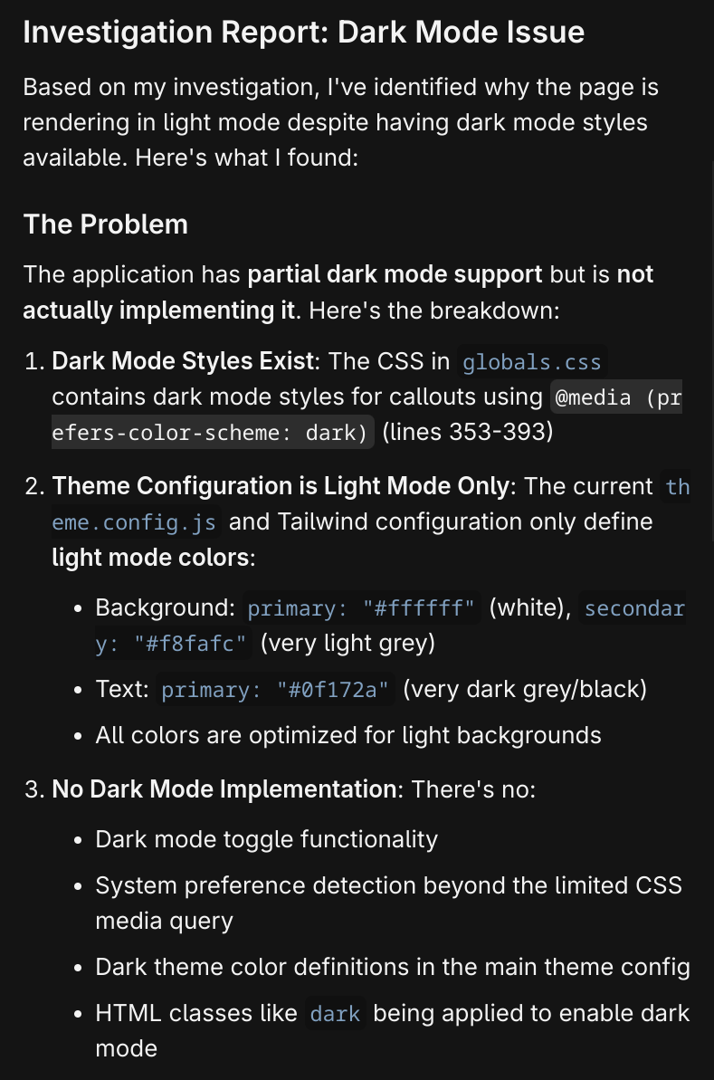
Honestly, this isn't a satisfactory answer. In my cursory research into this css file, I can't tell why this dark mode css is being selected. Let's see if the robot can tell us.
To this prompt, I add the line containing the media query to its context -
globals.css (353-353).
Interesting....this is true. I do have system dark mode set, let's change that and confirm that the rendering of the website changes.

Well...I'll be...the robot suggested three options to fix this:
- Option 1: Remove the Dark Mode CSS
- Option 2: Override with Light Mode Styles
- Option 3: Implement Proper Dark Mode
We don't have dark mode yet, so let's go with Option 1!
Now your callouts will consistently use the light mode styles regardless of your system's dark mode setting:
Solid, vibrant backgrounds (like bg-blue-100, bg-yellow-200, etc.)
No transparency/opacity effects
Proper contrast and readability
The changes should take effect immediately when you refresh your browser. Your callouts should now appear with full opacity and the intended bright, solid colors instead of the washed-out transparent versions.
Well, it worked!
This has been a simple example of combined investigation: human and machine. I have done full vibe debugging in more complex scenarios and I have not been too impressed with the amount of re-prompting I have to do, especially if I do not know anything about the codebase at all.
This example shows how, with a little bit of investigation and prior knowledge on the human end, we can guide the AI correction and even ask for explanations on what needs to be done. We've also opened the potential for an easy dark mode through tailwind that I never knew about before!